


Lab Reach - Laboratory Credentials, Made Simple.
With clinical laboratories suffering from staffing shortages, there is a need to make the field more accessible to newcomers. By consolidating resources and career opportunities for lab scientists, Lab Reach aims to improve attrition and give a boost to an often overlooked industry.
Introduction
The problem.
Laboratory technicians are essential workers that are involved in nearly every inpatient procedure performed by hospitals. There is very little representation in popular culture for this field, and the general public has little understanding of the career. This has led to serious staffing shortages in many hospitals nationwide.
To compound the staffing issue, many people who apply for these roles are rejected due to insufficient qualifications. There are few people interested in pursuing laboratory science, and those who are face serious setbacks in terms of resources available to educate them.
The goal.
I wanted to complete an MVP for a mobile application that would connect prospective laboratory technicians with educational and career-related opportunities. Deliverables would include:
Secondary research report about the problem space
Competitive analysis
Two provisional user personas
User journey map
Brand system
Component library
Wireframes of varying fidelities
A functional prototype
The focus of this project was twofold: to be an exercise in user research, and to complete a cohesive and appropriate branding system for a health tech application.
Exploration and Research
Background research.
My research was approached from two angles: extensive secondary research, and an interview with a subject matter expert. I completed a competitive analysis of other similar products in the space, including nursing shift scheduling apps and mentorship systems for healthcare professionals.
My SME was a clinical laboratory director who had thirty years of experience in an in-house state hospital lab setting. She detailed that staffing shortages were, in her words, the largest and most immediate problem facing lab operation. She went on to describe what she had experienced both as a practicing laboratory technician, and an administrative figure. One of the most helpful insights she provided was about a very specific and prominent issue in the hiring process: applicants for laboratory technician roles that had previous lab experience, but were still deemed unqualified.
Personas.
Two personas were created: one was relevant to the MVP, and the other was for a hypothetical expansion of the product in which an administrative/corporate account may be created.

Ethan is a former Labcorp employee, and has real-world experience in a clinical laboratory setting. He hopes to gain employment at a local hospital, and attempts leveraging his experience with his previous employer to do so; however, after submitting applications, he realizes he’s being rejected because he’s considered “unqualified.” He isn’t sure how to advance his career, or what he could be doing in order to better position himself as a favorable candidate for hire.

Roberta is a hiring manager at a hospital, and sees many candidates applying for roles as lab techs; unfortunately, she has to reject many of them because they aren’t properly qualified. She and her hospital want to encourage education and support of prospective lab techs in an attempt to bolster the workforce.
Designing the Solution
Ideation.

Wireframes.

Low-fidelity wireframes include several features/screens that didn't make it to the final design. At the bottom left, and in the red button on the top row, you can see where I originally intended to have a career quiz. This quiz would allow the user to input details about their education, and get results tailored to their specific career journey. Ultimately, this feature was scrapped for scale.

Further iterations start to show the app taking some shape. Many of the screens shown above look very similar to my final designs. The largest struggle in this stage was the navigation: looking at the bottom nav bar, you can see tabs for home, bookmarks, user profile, and settings. In later designs, these were consolidated into a home/library page, a search page, and a settings page. The search page is front and center, as the majority of the user's time using this app would be utilizing the search functionality.

My first high-fidelity wireframes include more streamlined card designs, a fleshed-out filter page, and a reformatted certification detail page. Originally, the four categories of information (responsibilities, details, application, and eligibility) were all going to be on one page with hyperlinks at the top, allowing the user to jump down to each section. After realizing just how much information would need to be listed, I made the decision to separate each category via a horizontal nav bar. This made a huge difference in the usability of the app by reducing scrolling time.
Brand identity.
The brand follows three core values: intelligence, empathy, and openness. Creating a brand for this product was a balancing act between the characteristic sterility of medical imagery, and the supportive feeling the app should give to its users. Too much warmth would veer outside the norm for the healthcare space, but a brand too cold would be emotionally alienating.

A familiar blue color scheme was used in order to strengthen an association with medicine. A blue-toned red was included as a secondary color to assist with this. The shape language includes geometric shapes (particularly hexagons) with 9px rounded corners. This implies conformity while also remaining friendly to the user. The typeface used for body text is Assistant. This is a welcoming but professional sans-serif that utilizes modern letterforms and gracious tracking.
Glassmorphism is used in many of the UI components for Lab Reach. This style was chosen in order to evoke imagery of microscope slides, which are a common tool used in the field. This familiar image would serve as a tether between real industry experiences and the user experience when using the app.
Task flows.
The most important task flows to complete were search function flows. At the current scale, this application would be used primarily to find existing credentials for laboratory science. In order to create an MVP, this flow would need to be fully operational.
User feedback.
User testing of the Lab Reach prototype was conducted among four separate users. Two users were familiar with the career field, while two were not. A combination of in-person and remote video calls were utilized.
The primary goal in these sessions was to assess the in-app navigation system. Test participants were given the following task: navigating from the home page of the application to a certification detail page within thirty seconds. Four out of four participants were able to accomplish this goal.
User feedback showed overall satisfaction with the navigation system. According to the participants, the primary areas that needed improvement were landmarks within the app. While users could navigate their way to a page easily, once they had reached their destination, it was sometimes unclear where they were. To solve this, I added clear headings and subheadings to each section, and made sure to redesign my secondary navigation tabs to make the user's location more obvious.
Users also remarked that the filter system was confusing, primarily because filters chosen on the filter page weren't visible when the user returned to the search page. In response to this feedback, I designed filter tags that would appear on the search page, and could easily be removed by the user without having to access the detailed filter page.
Conclusion


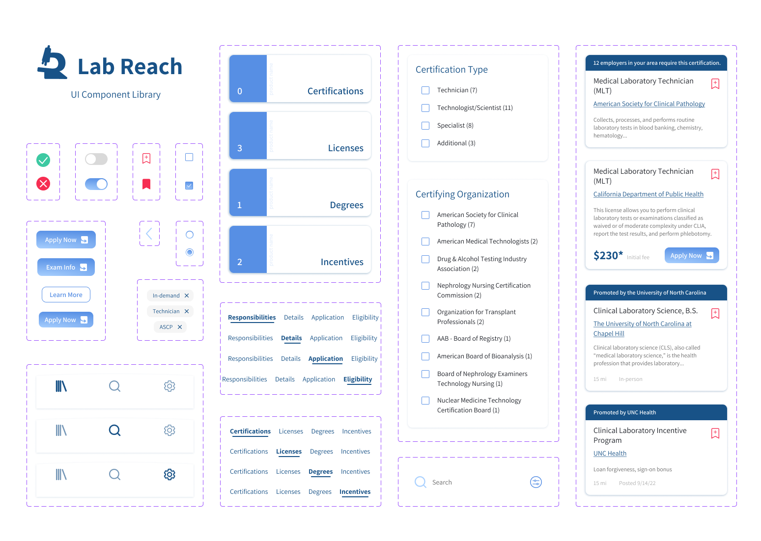
The Saved Resources page is the landing page for the app. Four categories are presented to the user: Certifications, Licenses, Degrees, and Incentives. The number in the bottom left of each section indicates how many resources have been saved in that folder. The decision was made to have the saved resources be front and center, because users will frequently be checking back on many of these items, and should have access to them as quickly and conveniently as possible. Each section is designed to mimic a microscope slide, which is one of the most common tools used in laboratory science. The "glass" of each section can be seen blurring the image behind them.
Once a resource has been saved, it will be added to the relevant folder. The resource can be unsaved at any time by clicking the red bookmark. Quick action buttons, like the "Apply now" button shown in the licenses folder, are available when relevant and link to external sites. The user can also filter through results, or search for specific keywords, in order to more efficiently comb through their saved resources.
Final product.
The final MVP’s success can be measured in two ways: in terms of personal experience gained in creating branded projects with cohesive asset libraries, and in terms of improving career prospects for aspiring lab techs.
As I was able to gain valuable experience with crafting brands that address the needs of users, from my end the project was a definite success. I was able to translate my existing design skills into creating a branded experience that would be in-line with competitive products in the health tech space. From the user’s perspective, success can be assessed by conducting user testing sessions to gauge potential career progress. That progress might be measured in acquired financial aid, information about the field in general, other forms of support/resources, and job opportunities.
Next steps.
The MVP for this project was built for scale. There are multiple avenues by which the product can be expanded to better serve the needs of users:
A parallel user experience intended for hospitals, clinics, universities, and other sponsoring organizations. This two-sided approach to the application would be advantageous to both sets of users by increasing opportunities provided to potential technicians, and boosting staff numbers for employers.
Including a built-in application portal. Currently, users need to be redirected to locations like the ASCP website in order to submit applications for certifications, or to apply for grants. By building this feature, users would be able to advance their careers directly within the application.
Push notifications for recent job postings, messages, and time-sensitive opportunities.
A robust job-hunting feature.
Lessons learned.
Always follow established patterns. This is especially relevant when designing for an unfamiliar industry. When you find yourself trying to break the mold and do something incredibly daring, it can be helpful to remind yourself that many designers have come before you, and they made their decisions for a reason. Not everything needs an overhaul. Oftentimes it's best to focus on certain areas that need improvement, but keep the rest as you found it. That will make things much easier on your end user, as well!
Your navigation system can make or break your design. One of the biggest goals in any application design should be ease of use. Ideally, the user can get straight to the information they need in the shortest time possible, and doesn't feel any confusion about where they are at any point in using the product. When dealing with large quantities of information, making decisions about how and where that information should be accessible is one of the most important steps in the design process. I went through many different iterations before I was able to design a version that makes navigation as easy as possible.
Take every chance you get to learn something new. Industry experts are irreplacable. Without my SME, my design would have been completely different, and I would have missed out on so many essential insights that got me to the finish line. As a UX designer, we often create products for fields we have little to no experience in. The best designs are ones that come from a place of care and truly center the experience of the user, and we can't achieve that level of empathy without speaking directly to the people we're designing for.