


Responsive Dashboard Design – Food Bank of Central & Eastern North Carolina
Introduction.
For this project, I’d be working hand-in-hand with the Volunteer Coordinator of the Durham branch of the Food Bank of Central and Eastern North Carolina, and making a mockup for a responsive dashboard design for volunteer management. The deliverables were as follows:
Interview with SME
Competitive research
Accessibility audit of current solution
Feature scorecard
User journeys
Mockups of various fidelities
The goal.
The goal here was to build a more efficient and pleasing dashboard design. The existing software used to coordinate volunteer efforts was mostly functional, but had a slew of problems that rendered it ineffective for the Food Bank’s userbase. By crafting a solution that learned from the missteps of the current software, I would be able to speed up interactions between the Food Bank’s employees and volunteers, thus leading to more pleasant day-to-day operations and efficient internal processes.
Exploration and Research
When speaking with my SME, a large concern he made sure to mention was usability. Volunteers he interacted with on a daily basis could be of any age group, from teenagers to elders, and some people had more technological proficiency than others. It was very common for volunteers to become confused or unsure how to proceed when interacting with their current software, CERVIS. Since he put special emphasis on this, I knew my next step would be to assess CERVIS for any weak spots in their usability and accessibility practices.
Usability audit.
In order to make my design as accessible as possible, I completed an audit on the CERVIS dashboard using the Nielsen usability heuristics. There were some areas in which CERVIS was quite usable; the information was generally presented in a legible way, and design elements were consistent across all pages. The biggest weaknesses I saw, however, were in terms of minimalism and navigation. The interfaces were incredibly text heavy, with little imagery or contrast to guide the user’s eye, and navigating from page to page was unnecessarily confusing.

This is the home page, and the first thing the user sees. Three of the four buttons in the nav bar link to the same page! And the text-heavy list view (which continues down the page) is inefficient at drawing the user’s eye to the most important information.

When selecting a volunteer shift, each shift is listed in plain text without a calendar interface, which is how most users are accustomed to selecting dates or times. And there are checkboxes that allow the user to select multiple shifts to sign up for, when in reality, the average user signs up for one at a time.
Designing the Solution
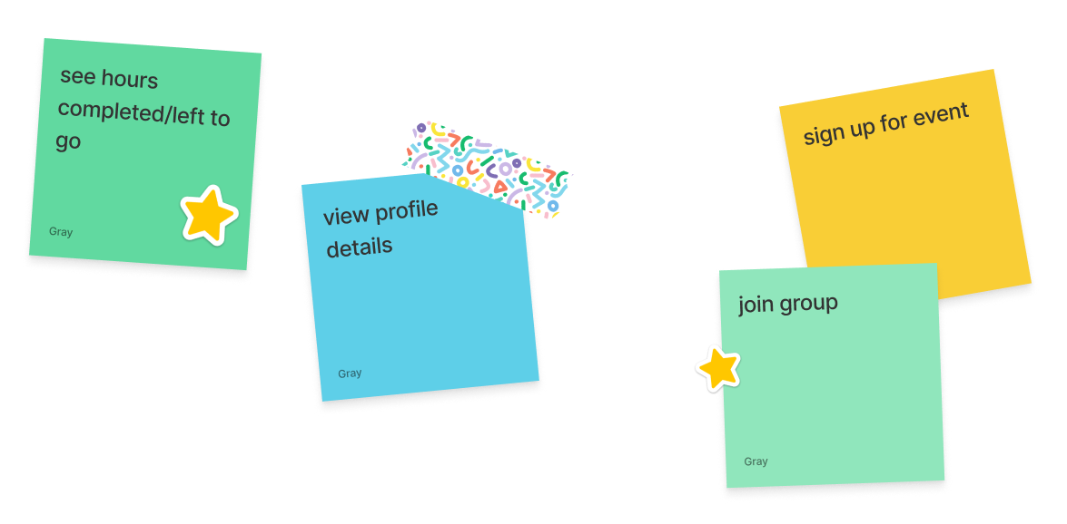
Product features.
I was fortunate in that I had a preexisting product to compare my work to. Playing off CERVIS’ existing features gave me a great head start, but alterations definitely needed to be made to better suit the needs of the Food Bank. Since I was designing a dashboard, only the most essential features would ultimately be present in the final product, so I needed to be selective with what to include.
Ideation.
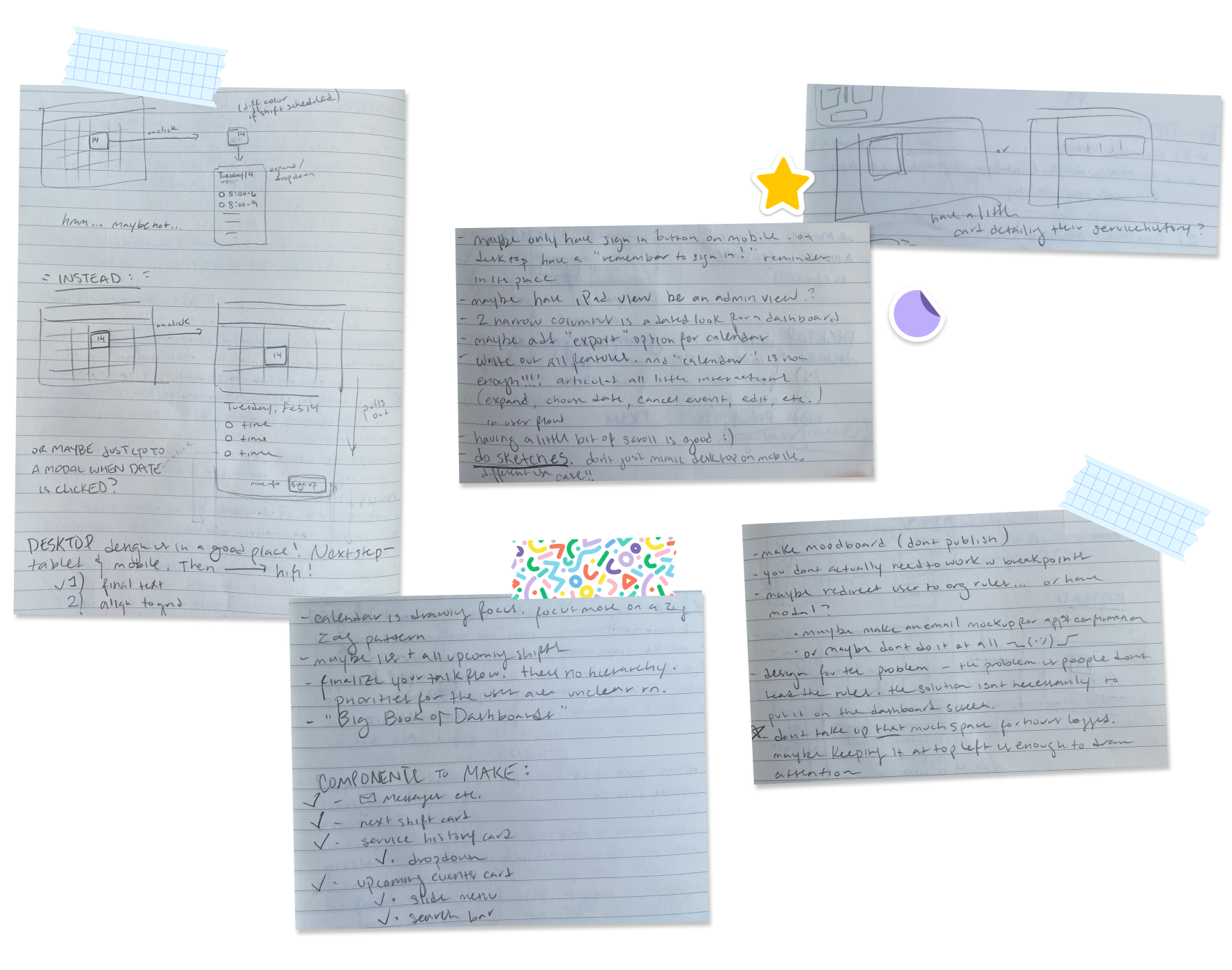
Wireframes.

Early explorations for the desktop design. The primary focus in these designs is determining what information is essential to the user experience, and how to best arrange that information in an intuitive way.

More refined explorations. The size of the calendar went through many changes, as well as the position of the Upcoming events section. These wireframes are very visually dense; more generous padding between elements was added in later iterations to reduce visual load.
Brand identity.
The Food Bank’s brand wasn’t very comprehensive, at least from the perspective of an external viewer. The only concrete assets I could find were a wordmark, a tagline, and three brand colors. Since I had a little wiggle room to work with the brand, I decided to make a few slight adjustments to add a little visual polish, but keep the essential brand recognizable.

The preexisting CENC logo and brand colors. These were the only clear brand components publicly available. I knew I wanted to maintain this visual feel, but felt that elements could be given a more friendly, fresh look.
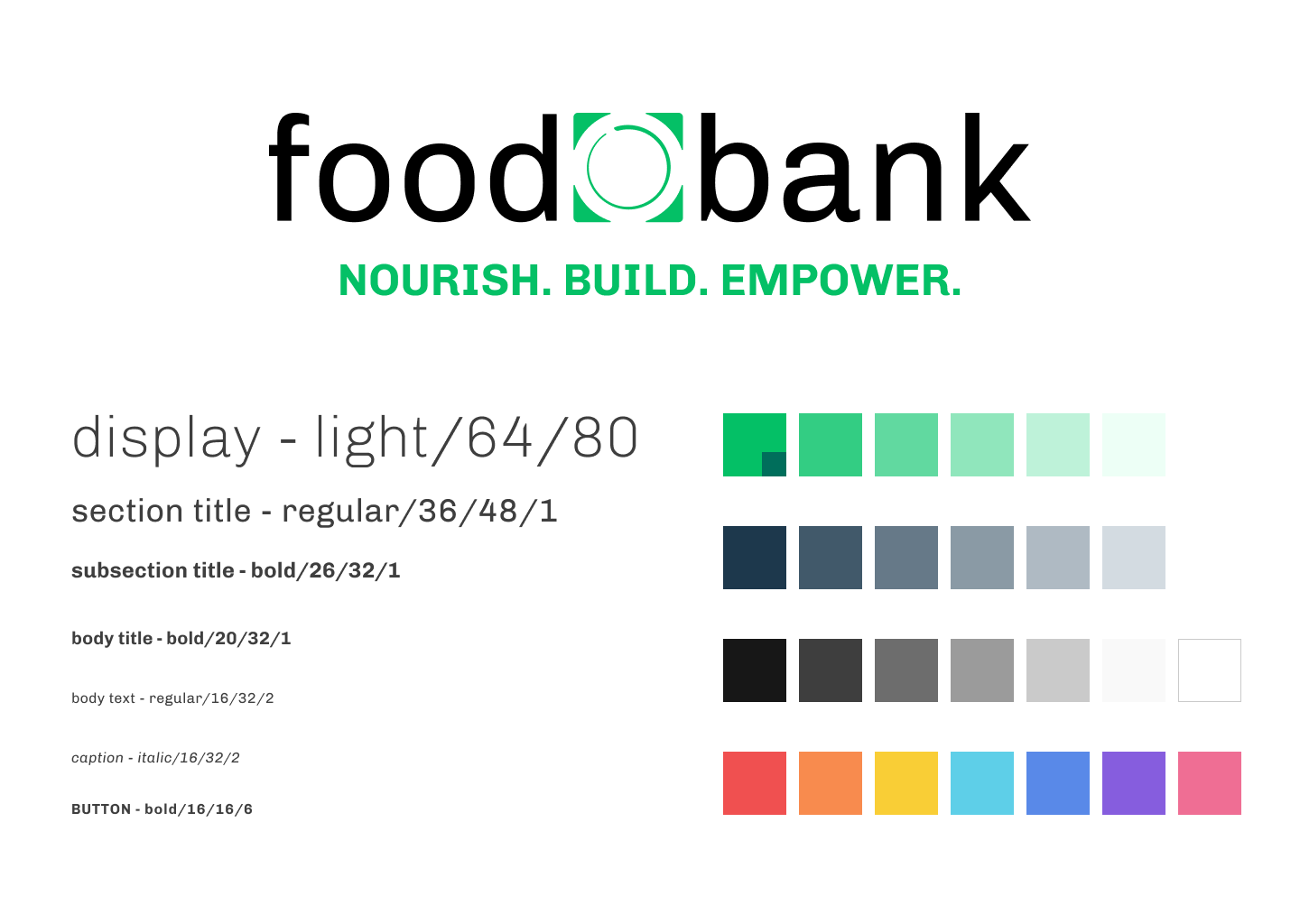
The primary changes made were to the brand colors. The green and navy were shifted to be a bit bluer, which adds a soothing energy, and branded hues were also chosen. The typeface used throughout the final interface is Chivo; this adds a thicker weight and more generous tracking to the wordmark, which previously felt a bit visually imbalanced due to the sleek letterforms.
User feedback.
Attaining user feedback was essential to my design process. The visual hierarchy went through many iterations, even during the mid-fidelity phase, as a response to remarks made by four test users. Large concerns, such as hierarchy, and smaller concerns, like specific verbiage and clarity of language, were all given my attention.
One of the biggest areas of concern was the calendar design. Since the primary function of this dashboard, particularly on a mobile interface, is to schedule shifts, users paid special attention to that aspect of the UI. Originally, I drafted versions of the calendar that would have an indicator of the shifts available on each day. This was ultimately scrapped in response to feedback. Users found the design to be unclear and confusing, with most users unsure of what was being represented. These concerns led me to scrap this aspect of the design, and instead give more visual space to the event cards, which would ultimately show the same information in a clearer way.
Conclusion


In the profile overview, the user's profile photo, name, rank, and email are listed for easy viewing. Additional tags are also shown: the company with which the user is affiliated, any groups they may be a part of, and any volunteers linked to their account (usually children or dependents). On the desktop view, there is a button which allows the user to make changes to their current affiliations. This option is not available on mobile views, because user research indicated most users only use mobile views to sign up for shifts.
The upcoming event card only presents key information, with more details available after the user clicks the sign up button: the event title, the dates of the event, and the category of event. The event category is also indicated by the color on the left side of the card. On the desktop view, there is also a counter that shows the user how many volunteers are still needed.


The service history card is one of the features my research indicated to be essential. Many users are volunteering with the CENC Food Bank as part of mandatory community service, and these users usually check how many hours they have left to complete after each shift. For reporting purposes, they also sometimes need to document how many hours of service were completed on certain dates. This card, along with the easily accessible "Request Service Record" button, makes attaining this information as convenient as possible.
Final product.
My primary focus was creating a more visually intuitive interface for the user. A dashboard should present information in a no-nonsense, but pleasant way, and be straightforward to navigate. By using strong visual cues rather than relying on an abundance of text, and grouping relevant information more accurately, I believe my design to be more user-friendly than its predecessor.
I also needed to make this dashboard responsive for mobile and tablet views. In order to adapt to an upright tablet view, I switched from the desktop’s horizontal layout to a vertical layout. This allows the “Upcoming events” section to remain at the bottom right and maintain consistency and reduce cognitive load, while leaving ample space for scrolling down to the lower options in the list. The mobile view required more comprehensive changes. Only the most relevant user information remained immediately viewable on the home screen. This is because the primary purpose of accessing the dashboard via a mobile device is to schedule a future shift, rather than view user statistics or groups.
Lessons learned.
Dashboard design is a major undertaking. Around half of the time spent on this project was probably revising my dashboard wireframes, trying to strike the perfect balance of crucial information and features at the user’s fingertips.
If possible, always speak to the user directly. This project relied heavily on the insights provided by my SME. By having access to someone who works with a product like this on a daily basis, I was able to gain empathetic looks into the perspective of the user, and ensure their needs were always kept in focus.
Keep sight of the scope. There were many times throughout these two weeks in which I had some grand idea for how to revolutionize the product, or integrate a massive new feature. While it might be very exciting to imagine a project in which the sky is the limit, ultimately, the most successful designs are the ones that know their boundaries, and are transformative without breaking them.